Information Architecture Analysis
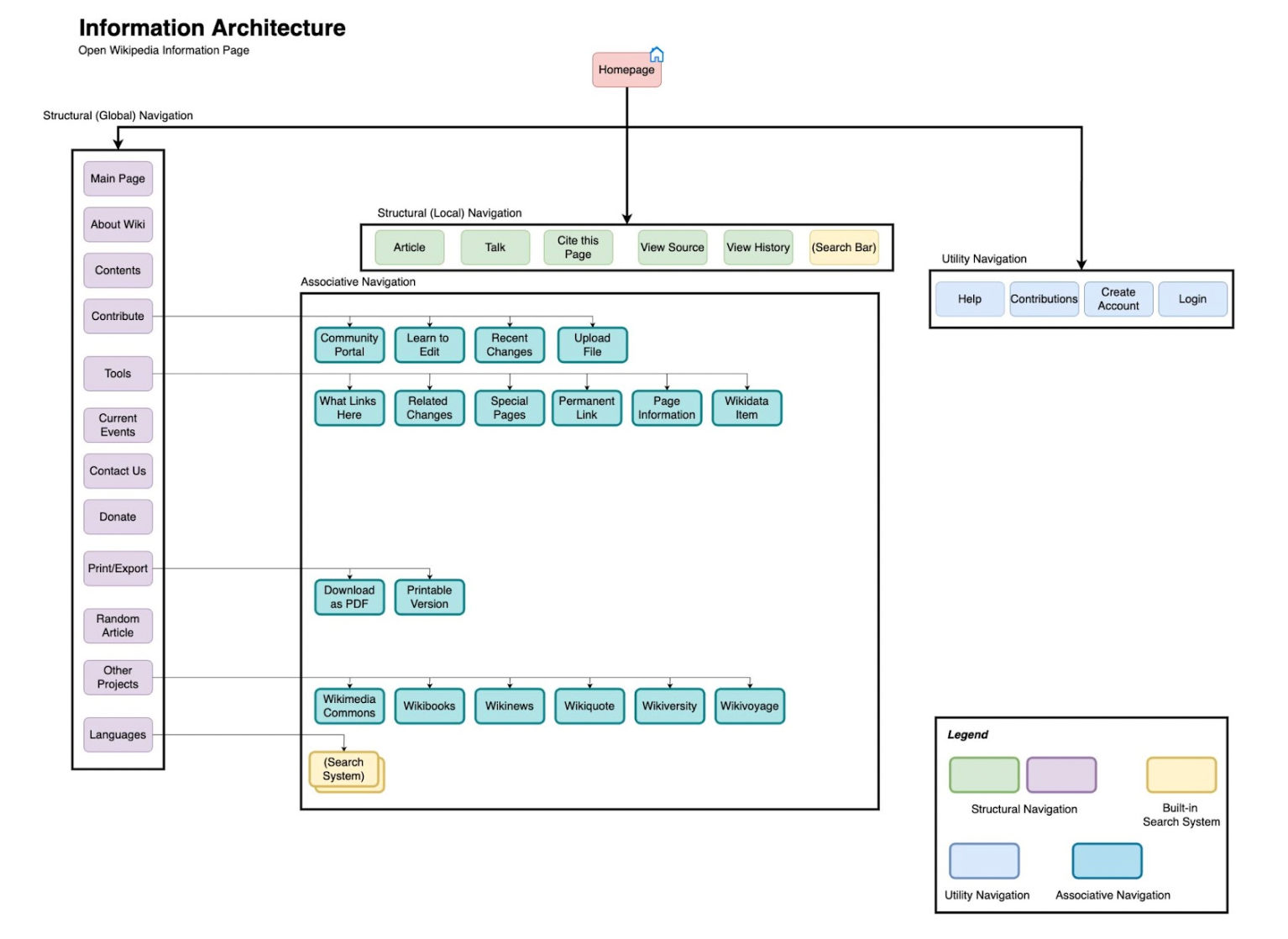
I started by dissecting the current IA of the Wikipedia page, mapping out its structure through a node-link diagram. This helped visualize the navigation elements: Structural, Associative, and Utility.

Node-link diagram for Wikipedia's Current IA
Redesigned Information Architecture
The revamped IA was meticulously crafted to align with principles covered in class and industry best practices. The following key considerations guided my design decisions:
Simplicity and Resourcefulness:
My commitment to a clean and resourceful design is evident throughout my project. In my redesigned IA and wireframes, I carefully curated the navigation elements and content to ensure users have effortless access to essential resources. By decluttering the interface and presenting only what's necessary, I aim to prevent users from feeling overwhelmed. The new IA's simplified structure makes it easier for users to find the information they seek quickly, eliminating unnecessary clicks and navigation hurdles.
User-Centric Approach:
I delved into the motivations, goals, and expectations of the website's visitors. This understanding allowed me to tailor the interface to their preferences. By prioritizing user goals and aligning the IA with their expectations, I've aimed to make the user experience more intuitive and relevant. My design decisions were guided by empathy for the end-users, resulting in an interface that resonates with their needs.
Streamlined Categories:
I was dedicated to enhancing user experience which is evident in how I streamlined categories within the IA. By eliminating redundancy and reorganizing content, I've created a more logical flow. Users can now navigate seamlessly without confusion caused by duplicated options. This streamlining ensures that users can easily locate the information they're looking for, leading to increased engagement and satisfaction.
Business Integration:
My strategic placement of business-oriented options like "Donate" and "Contact Us" reflects my consideration of both user needs and the website's goals. By giving prominence to these options, I've not only made them easily accessible to users but also ensured that the website's business objectives are well-integrated into the user experience. This synergy between user-centricity and business integration is a testament to my holistic approach.
Optimized Placement:
My careful consideration of option placement demonstrates my commitment to enhancing user interactions. By relocating crucial options to prominent positions, I've improved their discoverability. Placing options like "Contribute" and "Tools" at the top ensures that users don't have to search for them, minimizing user effort and maximizing engagement. This optimization contributes to a more seamless and efficient user journey.
Scalability Consideration:
I factored in the potential growth of information on the website, ensuring the design remains adaptable over time. I did this by ensuring flexibility, I designed the IA and wireframes in a way that could easily accommodate new elements without causing disruption or requiring major redesigns. Moreover, the strategic placement of elements, use of collapsible sections, and clear headers ensure that additional content can be easily slotted into the design without cluttering the interface. For instance, the collapsible drop-downs on mobile screens prevent information overload as more options are added.
Proposed IA
Node-link diagram for Wikipedia's Proposed IA
Notable Changes:
• The "Talk" and "Read" options were observed to refer to the same content, causing confusion for users. Merging these options into a single "Cite this Page" feature eliminates redundancy.
• The "Talk" option in the Utility Navigation duplicated its presence in the Structural (Local) Navigation, which seemed redundant and unnecessary. In its place, I introduced a helpful "Help" option to better serve users seeking assistance. This streamlines the navigation and provides valuable support within easy reach.
• The original positioning of options within the Structural (Global) Navigation did not prioritize the most frequently used features. I reorganized the structure to elevate crucial options like "Contribute" and "Tools". This reordering ensures users can quickly access essential tools and encourages contributions.
• For newcomers, understanding the purpose and scope of the website is essential. By prioritizing the "About Wiki" section, I aimed to offer clear information for users new to the platform. This change aids in reducing ambiguity and enhancing the initial user experience.
• While business-oriented options like "Donate" and "Contact Us" are significant, their positioning was optimized to strike the right balance between prominence and relevance. By moving them slightly down in order, I ensured that they remain accessible without overpowering the user experience.
Wireframes and Visual Design
To visualize the proposed changes, I created comprehensive wireframes for both desktop and mobile interfaces. These wireframes incorporated insights from the IA analysis and provided a clear representation of the improved layout and functionality. Media elements within the wireframes adhered to design principles such as depth of field, rule of thirds, and screen direction. The logo was also self-designed using Adobe Illustrator.
Desktop Wireframes
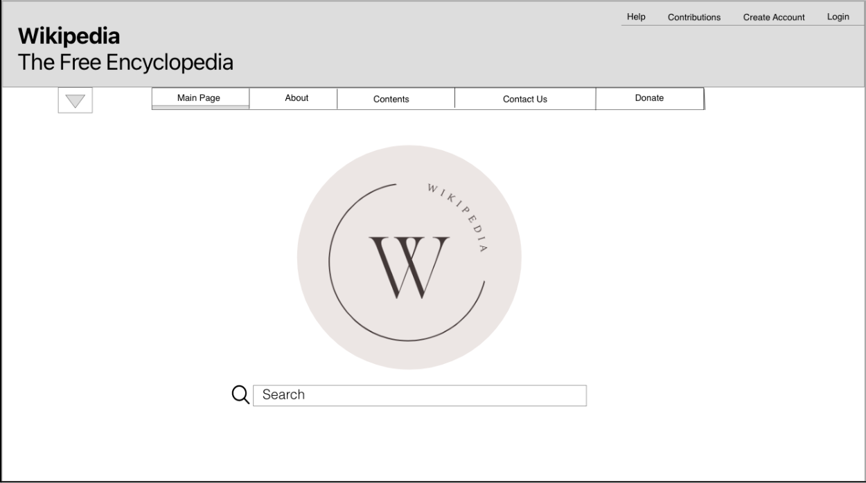
Main page wireframe
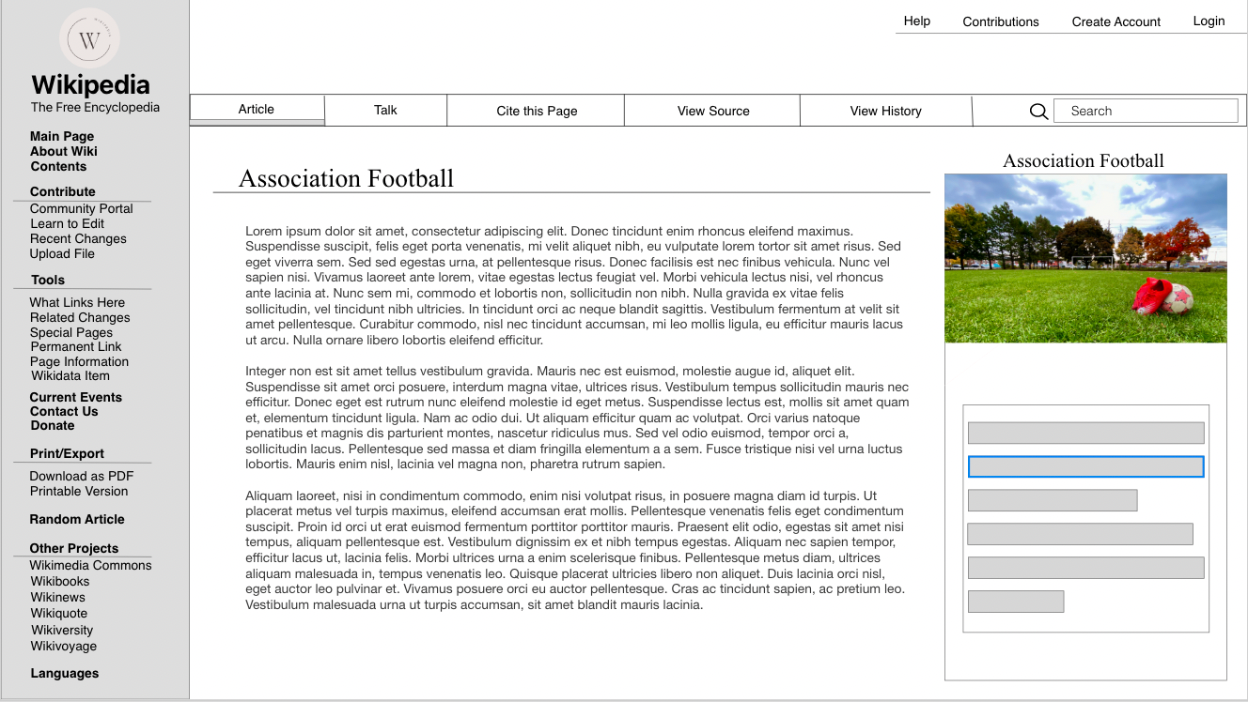
Article page wireframe
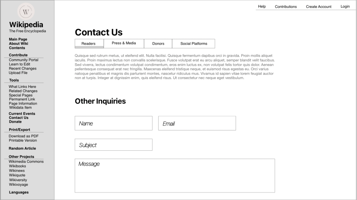
Contact us page wireframe
Mobile Wireframe
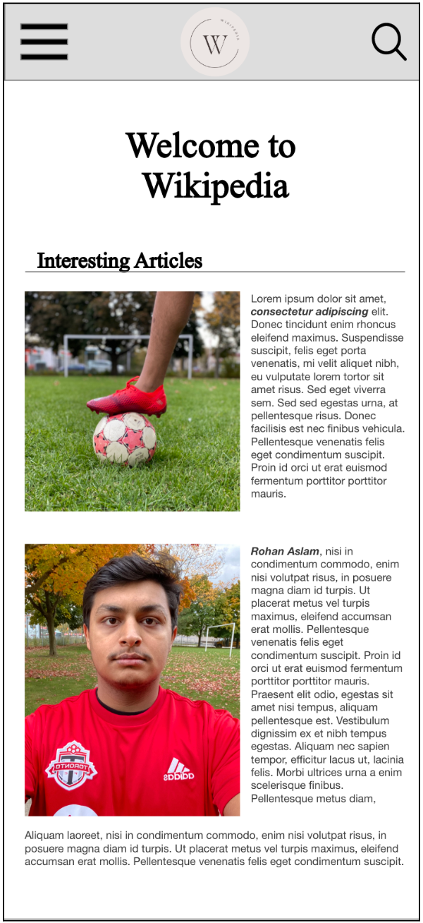
Main page
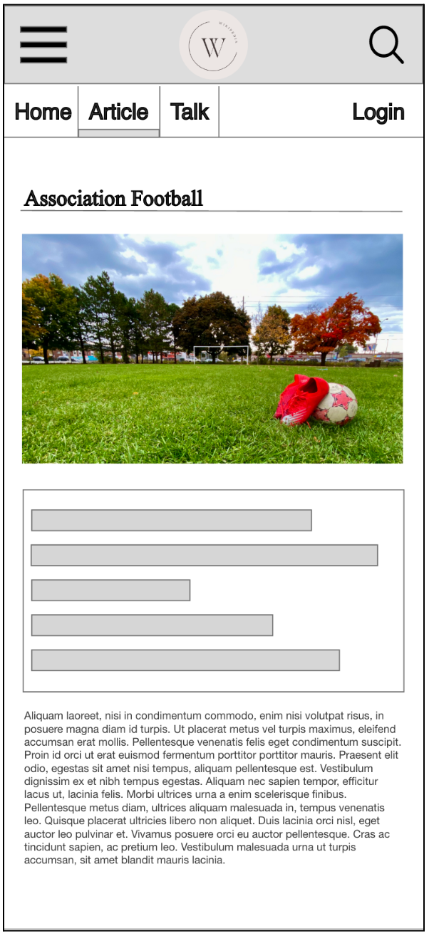
Article page
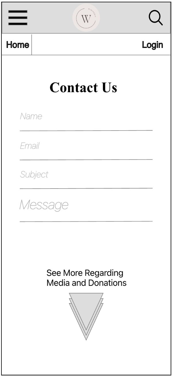
Contact us page
Design Process
I was influenced by renowned interfaces like Apple, Airbnb, and Netflix, I incorporated their successful features into my wireframe. Key design principles included:
Front Doors
Ensured easy access to the homepage from any page, catering to users who land directly on sub-pages.
User Optimization
Tailored the interface to the audience's needs and goals for a personalized experience.
Simplified Interface
Created an intuitive layout to aid newcomers in finding desired information quickly.
Efficient Navigation
Presented essential tools like "Cite this Page" prominently for user convenience.
Clear Titles and Headers
Used descriptive headings to guide users through categories and options.
Mobile Optimization
Employed collapsible drop-downs to prevent essential content from being hidden on mobile screens.
Testing and Refinement
Thorough testing was conducted, involving real-world scenarios such as navigating through different pages, creating citations, searching articles, and more. To ensure a comprehensive evaluation, I sought feedback from a diverse group of individuals, including students who are regular users of Wikipedia and my elder family members who frequently browse the platform for information.
I engaged with students from my school who actively use Wikipedia for various purposes. Their insights provided a valuable perspective on the usability and accessibility of the redesigned IA and wireframes. Through discussions and observation, I gained valuable insights into their browsing behaviours, preferences, and pain points. This direct input from the primary users helped me identify areas for improvement and refine the design based on their needs.
In addition, I consulted with my elder family members who often turn to Wikipedia for information. Their experience provided a different lens through which to view the redesign. Their feedback helped me ensure that the changes I made were not only appealing to a younger audience but also user-friendly for those who may be less accustomed to navigating digital platforms.
By incorporating feedback from both students and older family members, I was able to gather a well-rounded perspective on the usability of the redesigned IA and wireframes. This approach allowed me to fine-tune the design, address any potential usability issues, and create an interface that is intuitive and engaging for a wide range of users.
Conclusion
In summary, I embarked on a comprehensive analysis and redesign of the Association Football Wikipedia page to optimize user engagement and experience. The new IA, represented through node-link diagrams and wireframes, reflects a blend of practical insights, industry principles, and my original design contributions. This project underscores my ability to critically evaluate complex systems and translate that analysis into tangible UI/UX improvements.